Categories
Design Software Technology

SwiftUI vs UIKit – why is declarative programming the future?

As an iOS developer, it’s important to know and understand SwiftUI and it’s predecessor UIKit – a framework used to build graphical, event-driven interfaces for mobile apps. When SwiftUI was announced at Apple’s WWDC event in 2019, it immediately grabbed my attention. It’s a huge release and change in building graphical interfaces since UIKit, which is now over 10 years old. But why, and what makes it so different from UIKit? Its use of the declarative paradigm instead of the imperative paradigm. Now we are in the year 2023. It’s been 4 years since the first announcement and I can tell you that SwiftUI is definitely the future of iOS programming!

Imperative programming

Imperative programming is a paradigm that focuses on describing the specific steps or procedures to achieve a desired outcome. In this approach, developers give explicit instructions to the computer on how to perform tasks and update the user interface. UIKit uses an imperative programming model.

Imperative programming requires developers to manage the state of the application and handle UI updates manually. For example, to display a button on the screen, developers must create the button object, specify its attributes, and explicitly add it to the view hierarchy. As the application evolves and state changes, imperative code becomes more complex and difficult to maintain.

UIkit vs SwiftUI

UIKit has been used as an imperative framework for app development for a long time. While it has served developers well, it has had its limitations and a legacy feel in some areas. As applications became more complex, UIKit codebases often became unwieldy and difficult to maintain.

Making changes or adapting to different screen sizes and orientations required considerable effort. SwiftUI addressed many of these challenges with its declarative approach. It introduced a more natural way of building user interfaces by allowing developers to declare the desired layout and appearance of UI elements.

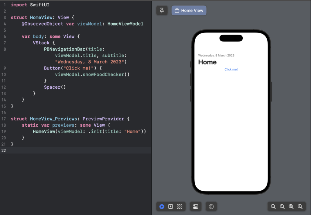
The framework automatically handles the underlying complexity of managing the user interface. This makes the code more maintainable and scalable. SwiftUI also provides a live preview feature that allows developers to see changes to the UI in real-time as they write code. This significantly speeds up the development process and improves the overall developer experience.

UIKit and SwiftUI view visibility code.
Figure 1. A snapshot of SwiftUI code demonstrating the use of navigation bars and buttons, as compared to UIKit

Examples

Let’s examine a few examples to illustrate the differences between UIKit and SwiftUI in action.

Creating a button

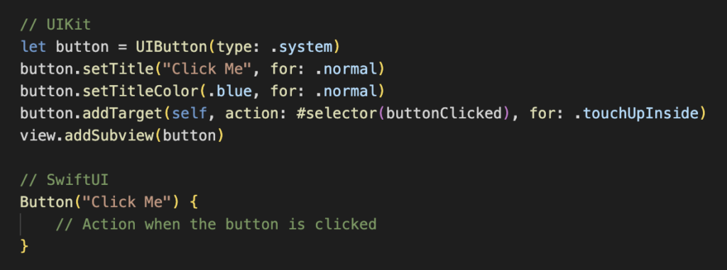
In UIKit, creating a simple button involves several steps, including initialising a UIButton object, setting its properties (such as title, colour, and font), and adding it to the view hierarchy using addSubview(). Any updates or changes to the button’s appearance or behaviour require manual adjustments to its properties and event handling using addTarget().

SwiftUI, on the other hand, takes a much simpler approach. To create a button, you simply use the Button view and specify its label text. SwiftUI takes care of the rest, including handling the button’s appearance and actions. For example:

Differences of button configuration in UIKit and SwiftUI.
Figure 2. A side-by-side comparison of button configuration in UIKit and SwiftUI.

Conditional visibility

When dealing with conditional visibility of views, UIKit requires you to manually show/hide views based on conditions, often involving complex logic and maintaining multiple outlets or references to views.

SwiftUI simplifies this process with its declarative nature. To conditionally show a view, you can use the if statement directly in SwiftUI. Here’s an example where a view is only displayed when a certain condition is met:

Differences in conditional visibility in UIKit and SwiftUI.
Figure 3. A side-by-side comparison of conditional visibility in UIKit and SwiftUI.

Handling lists

Working with lists in UIKit often involves implementing a UITableViewDataSource and a UITableViewDelegate to manage the data and appearance of cells. This requires managing data sources, registering cells, and handling updates explicitly.

SwiftUI simplifies the handling of lists with its own List view. To render a list of items, you simply pass an array of items and a closure that describes how to render each item:

Differences in list handling in UIKit and SwiftUI.
Figure 4. A side-by-side comparison of list handling in UIKit and SwiftUI.

These examples highlight how SwiftUI’s declarative paradigm greatly simplifies the code and makes iOS development more intuitive and efficient compared to UIKit’s imperative approach.

Pros and cons of SwiftUI

Pros of SwiftUI

  • Declarative syntax: SwiftUI’s declarative syntax simplifies UI development, making it easier to learn and understand for both new and experienced developers.
  • Swift integration: SwiftUI is designed specifically for Swift, leveraging its powerful features and type safety, resulting in more robust code.
  • Live preview: The live preview feature allows developers to see immediate results as they make changes to the UI, resulting in faster development iterations.
  • Platform adaptability: SwiftUI code can target multiple Apple platforms (iOS, macOS, watchOS and tvOS) with minimal modification, encouraging code reuse.
  • Animation support: SwiftUI provides built-in support for animation, making it easy to create visually appealing user interfaces.

Cons of SwiftUI

  • iOS version limitation: SwiftUI is available for iOS 13 and above, which means it may not be suitable for projects that require support for older iOS versions.
  • Learning curve: While SwiftUI is relatively easy for developers familiar with Swift and declarative programming to grasp, it may take some time for developers accustomed to UIKit’s imperative style.
  • Limited support for third-party libraries: Because SwiftUI is a relatively new framework, it may have fewer third-party libraries and resources than UIKit.

Conclusion

SwiftUI’s adoption of the declarative programming paradigm has revolutionised iOS application development. Its simpler and more expressive syntax, with live preview, allows developers to create robust and visually stunning user interfaces more efficiently. While UIKit has served the iOS community well for many years, SwiftUI represents the future of iOS programming. As the framework continues to mature and gain popularity, developers can expect further enhancements and improvements that will solidify its position as the first choice for creating user interfaces in the Apple ecosystem.

Categories
Design Software

The evolution of Material Design. From Material Design to Material You.

Introduction to Material Design

During the journey of every Android Developer, we have observed various Material Design language rules. We started with the first guidelines of Material Design in 2014. Then we acknowledged the set of updates to the language in Material 2 in 2018. Finally, we have seen the major changes in the newest version of Material Design called Material You (Material 3) in 2021. I will introduce these changes through the years from the Android Developer’s perspective and describe the most valuable changes and new things in Material 3. Let’s begin!

We will go through the following issues:

Versioning of Material Design

Material design is a design language (scheme or style that guides the product design). There were 3 major versions of this language.

Material 1

Google introduced the first version of Google Material Design in 2014. The primary purpose of creating this language was to combine principles of good design with technical and scientific innovation. It allowed the unifying design of Google applications. What else, developers can exclude basic components with Google’s material components API.

Source: https://en.wikipedia.org/wiki/Material_Design

Material 2

The next step was Material 2 (Material Theme), introduced in 2018 as an update of Material 1. The language went through some cosmetic changes to highlight the components even more.

The main differences between Material 1 and Material 2 are:

  • new font — Google Sans,
  •  more white spaces,
  •  rounded corners,
  •  colorful icons, and so on.

The video below is a great example showing the migration from Material 1 to Material 2.

Source: ‘Google Material Design 2.0’, youtube.com, uploaded by mobileCTRL, July 24, 2018

Material 3

Material 3, also known as Material You, is the newest version of Material Design. The two previous versions were strictly standardized. Otherwise, Material 3 focuses on user-oriented personalization. The newest version of the language introduced many updates. Some of them are listed below: 

  • dynamic colors based on the user’s wallpaper,
  • different shapes,
  • new typography,
  • changed components (for example bigger buttons)
Source: ‘Android 12 Official Release – What We Waited For!’, youtube.com, uploaded by In Depth Tech Reviews, October 20, 2021

I believe that James Williams explains very well the changes between Material 2 and Material 3 in the article ‘Migrating to Material Design 3′ (source: Material Design Blog, uploaded at October 27, 2021).

Let’s dig deeper into the major features of Material 3.

Characteristics of Material 3

Dynamic colors

Material You focuses on a variety of different colors and shapes. The colors are fully customizable. On the contrary, with material 2, more apps look similar due to strict standards.

Source: ‘Material Design’, material.io, link: https://m3.material.io/foundations/customization, January, 2023

The dynamic colors allow the app to match the system color preferences. As you can see in the example above, the colors in the app change every time users change the wallpaper.

Shapes

Source: ‘Material Design’, material.io, link: https://m3.material.io/components/widgets, January, 2023

Material You is based on a variety of shapes. You can distinguish different ones used on one screen and even the 7-level shape scale based on the roundedness of the component corners.

Source: ‘Material Design’, material.io, link: https://m3.material.io/styles/shape/overview, January, 2023

Material Icons

Also, Google has updated the icons to Material Icons, which can have slightly different versions. The symbols are easily customizable, and an updated version is available on the Google icon’s page.

Source: ‘Material Design’, material.io, 1. Outlined 2. Rounded 3. Sharp; link: https://m3.material.io/styles/icons/overview, January, 2023
Material Icons 1. Outlined 2. Rounded 3. Sharp;

Topography

The Material 3 typography went through simplification. As a result, from the 6 Headline variations, currently (Jan 2022), we have fewer variants for each classification (Small, Medium, Large).

Source: ‘Material Design’, material.io, link: https://material.io/blog/migrating-material-3, January, 2023

Design material components: Material 3

Buttons

Now, the buttons are rounded. Also, they are a bit higher than in Material 2.

Source: ‘Material Design’, material.io, link: https://m3.material.io/components/buttons/overview, January 2023

Floating Action Buttons

The Action Buttons in Android can be classified as Floating Action Buttons (FAB) or Extended Floating Action Buttons. FAB is a circular button that triggers the primary action in the UI apps. Extended Floating Action Button is the class with the Material Components library in Android. Concluding, it looks more rectangular now.

Source: ‘Material Design’, material.io, link: https://m3.material.io/components/extended-fab/overview, January, 2023

Switches

In Material 3, thumbs are not exceeding the switch track. Even more, there is a space between the thumb and the track.

Source: https://m3.material.io/components/switch/overview

Top App Bar

The Top App Bar and the status bar (displaying the battery and the network icons) now have the same color. Also, there is less contrast between the app bar and the content below. 

Source: ‘Material Design’, material.io, https://m3.material.io/components/top-app-bar/overview, January, 2023

Bottom App Bar

The users are used to the Floating Action Button at the edge of the Bottom App Bar. However, the new Material expands the bar vertically and keeps the button inside.

Source: ‘Material Design’, material.io, https://m3.material.io/components/bottom-app-bar/overview, January 2023

Navigation bars

The new navigation bar has a more distinguishable selected element by changing the icon to a fill version, bolding the label, and adding a shape around the icon in a different color.

Source: ‘Material Design’, material.io, https://m3.material.io/components/navigation-bar/overview, January 2023

Date picker

The main difference in the date picker is color theming and the component borders which are rounded and without a drop shadow.

Source: ‘Material Design’, material.io, https://m3.material.io/components/date-pickers/overview, January 2023

Time picker

Also, the time picker component is similar to the date picker component. I recommend a more detailed article about the implementation of the time picker component.

Check the article "MaterialTimePicker as an upgrade of the TimePickerDialog" (Patryk Kubiak, Feb 14, 2021).
Source: ‘Material Design’, material.io, https://m3.material.io/components/time-pickers/overview, January 2023

Design of other components

Other components which have the comparison between Material 2 and Material 3:

And here you can find a full list of the Material 3 components.

Conclusion

From its premiere in 2014, Material Design language went through dozen changes. After a while, there was an update to Material 2. That wasn’t a big deal. However, the major changes came with Material 3. The first Android system with Material 3 released in late 2021.

Today is the beginning of 2023, and I think the next 2–3 years are the time for validating and uploading improvements to Material 3.

Therefore, the upcoming versions of Android OS and different Google UI libraries for programmers will need some changes.

Let’s observe what Google will develop in the coming years!

Categories
Design Software

3 key business benefits of Product Design

No matter if you are starting a new business or just have a product that needs an upgrade, new functionality or adaptation to a new market – Product Design is something that you really should look into or least… consider.

Why? Because you probably want to reduce costs as much as possible, build a stable product, and get more positive feedback from your customers. It is more likely for customers to write negative reviews if something doesn’t work properly with your product.

What is Product Design?

Product Design is a way of arranging different features and benefits of the product in a special way that will be presented to the final user, which is usually the customer of the product.

Why is Product Design important?

Let’s start with the basics. Most people don’t understand that the design itself can be a crucial benefit. Why? Because Product Design is flexible and changes according to different technologies.

Let’s say that you were born in the 90s and you had a walkman. However, you also noticed that they disappeared after a couple of years. Their place was taken by an iPod. Now, in 2022, an iPod is obsolete because the iPhone has everything you need, so you don’t need an additional device to listen to your favorite music.

These three devices were all designed as music players (for an iPhone it was among its core features) but their Product Design was different according to evolving technologies.

Do you need another example? Let’s say that you have a car. Why do you like it? Why did you choose this brand over another? Because of the costs, different engine or the experience when you drive it? There are a lot of car brands on the market, but they all have the same thing in common – cars. They differ when it comes to features, different purposes, colors and other elements. Some brands offer something that is so special that you can’t find it served by anyone else.

The business benefits of Product Design

Now that you know what a Product Design is and what are the simple examples of it, we can focus on the benefits. The business advantages of Product Design can be sorted in a couple of categories.

As we mentioned, there are different groups of benefits that vary through industries. If a brand is willing to invest more in a good Product Design and create something that involves the users in all of the stages of designing, then a high ROI indicator is practically a formality. So, if you focus on the user, then you can be optimistic about the product’s success – it will most likely be chosen more often than a product from another brand.

As always, business indicators are loved by the stakeholders. The issue is that the product is used by customers, so thinking about the indicators will not bring revenue itself. If, however, you focus on the final user of the product, you have a much greater chance of success.

3 key business benefits of Product Design
Product Design process at Espeo Software

There is, however, one main problem with understanding the point of the Product Design process. For many, Product Design is something that is relevant at the last stage of creating a product or a service. Sometimes it is implemented after the strategy has been determined, the budget has been allocated, and decisions have been made.

However, if you want to achieve success with your product, Product Design should be implemented in the first stage – as a part of the business strategy.

At the beginning, you can save costs by changing materials, testing functionalities before they go to production and evaluating other indicators. The prototyping and user testing process enables you to understand your product or service to a whole new level, saving you money and time in the long run.

If you want to achieve success with your product, Product Design should be implemented in the first stage – as a part of the business strategy.

1. Increased sales

Product Design can increase sales thanks to implementing missing opportunities, especially for the final user of the product. Consequently, if the customer loves your product, he or she will probably stay with it longer than you anticipated. Greater loyalty comes usually with lower signals of complaints and bad reviews. At the same time – more good reviews and feedback can mean a snowball or a viral effect for your sales.

After all, people are more willing to buy a product with positive reviews.

Product Design adds more value to your product or your services. Users are often willing to pay more for well-designed products. Why? That’s simple – better design means that you offer benefits for them such as better functionality, greater usability, good visual, and functional experience.

2. Lowered costs

The fact that manufacturing processes can often be reduced by substantial amounts is another of the business benefits of a Product Design.

Knowing how to reduce the costs of your process and which materials are more efficient can allow you to allocate your budget elsewhere. An important aspect of Product Design is that it allows you to spend less money on promotions in order to acquire new customers. Instead, you want to have your business partner or a customer to stay with your product for a long period of time.

Even small changes can have a profound effect on how your product is perceived.

3. Increased performance

Product Design improves business performance across the market thanks to a better relative position to the competitors. Moreover, a strong identity of your business in the industry will follow that trend. Maybe you will even be able to open up for new markets? Expanding the offer or approaching new markets are indicators that you are performing well.

Get in touch with us if you need help with evaluating or testing your current product or a potential project

Among others, we can help you with:

  • Discovering where and how your design is being used in your business.
  • Learning what you can do to improve your business indicators.
  • Professional consulting related to the functionalities and current design process for identifying potential issues and listing ways for solving tracked issues.
  • Areas of missed Product Design opportunities.
  • User testing and conducting marketing research to get most valuable information about your customers base and their needs.
Categories
Design Healthcare

5 best UX design trends in healthcare for 2022

In the world of technology, everything is changing quicker than ever. This is especially true in the healthcare industry. During the pandemic, digitalization accelerated more than we would have expected. The healthcare sector faces new challenges but at the same time is finding better solutions for more issues. What are the top healthcare UX design trends that will dominate 2022 and continue to get attention in the next couple of years? Continue reading to find out.

Digital (remote) help

Telemedicine is probably one of the most popular healthcare UX Design trends right now that will be growing. This trend is likely to continue as more and more people need help as a result of COVID-19. While telemedicine does not always seem to be the best option for everyone and every situation, it can help more people worldwide. This is especially true in countries or areas where medical facilities are luxury or people lack access to them. Additionally, some users may find it more comfortable to manage situations remotely. What is important to remember is that telemedicine is also an option to reduce costs.

Telemedicine is still in its infancy, as not every medical doctor has access to the best tools. The area of medical apps is also growing rapidly but it is usually not available to all users that would like to have the chance to use it. Mostly because of the device requirement for those apps.

Patient-centric UX/UI design

One of the most important healthcare UX design trends is creating applications that are made especially for patients. It means that these kinds of applications should be created from the patient’s point of view. On the other hand, some apps designed for medical facilities are still not so user-friendly-oriented. There’s a whole room for this area to be explored and improved in the near future. People who have problems with vision, for example, should have the ability to adjust font sizes in applications. This kind of improvement around accessibility is crucial while considering UX design in healthcare apps. Another important element for patient-centric UI design would be making smooth graphics and visuals. Patients should be able to use healthcare apps and similar applications regardless of their skill levels with applications.

5 best UX design trends in healthcare for 2022
Source: Behance

Virtual and augmented reality

Virtual and augmented reality is one of another well understood healthcare UX design trends that should be on fire in 2022 and beyond. Our personal devices are more powerful than ever. Consider having a smartphone in your pocket that is capable of doing much more than a computer ten years ago. It is a normal thing today, and thanks to that, we have augmented reality in our pocket as well. Many apps are designed to help visualize elements or a whole thing thanks to augmented reality. Such innovations help with medical treatments. Furthermore, virtual reality is an important trend in healthcare UX design, as it allows for the creation of real 3D models. As a result, doctors and professionals are then able to treat patients in a better way.

UX trends in healthcare
Source: Dribbble

There is a whole spectrum of design that is targeted towards virtual reality. It is an even bigger topic than augmented reality so it is good to mention that in 2022, both of them will be growing. However, augmented reality will still be more accessible for most people. Some of the benefits of AR/VR tech:

  • Actions can be repeated in a training format (special reality with conditions)
  • Real damages to patient’s or equipment can be avoided in case of errors
  • Time and cost saving

Medical wearable technology

Fourth of our healthcare UX design trends for 2022 will be the growth of wearable technologies designed for health. Majority of wearable tech requires at least a smartphone with apps to run smoothly. This means that even diagnosing health conditions needs a special device, therefore UX designers need to pay attention to how it will be used. This is especially true when you think about designing such a device in a patient-oriented way for a better experience.

The best medical wearable technology is this kind of a device that does not look like a medical device, it’s working in a non-invasive way, and still gets you the data that you need. For many people around the world such a device is an Apple Watch, because it’s just a smartwatch that can measure a lot of your health conditions (mostly thanks to advanced algorithms) when you are living and when there is a need, it just sends you a notification. Can you imagine a valid ECG monitoring in a smartwatch ten years ago? I think absolutely not. Wearable technology is a big trend and will continue to grow in the future. For instance, in a study made in 2020 by PEW Research Center, 21% of Americans (around 70 millions people) claimed to use smartwatches or fitness trackers. And this is only one region!

AI and algorithms for health

As we mentioned earlier most of the data is now gathered thanks to advanced algorithms. Artificial intelligence is something crucial that we can’t forget because in healthcare, algorithms can find something in the data that we would look for another 10 years. Of course it’s just a metaphor but in many cases, AI can give advice based on a patient’s medical history in seconds thanks to processing large amounts of data. It’s a time-saving and cost-saving option for medical professionals. Moreover, algorithms and AI can help to automate paperwork or scheduling.

UX design trends in healthcare: summary

Healthcare is experiencing a boom in digital solutions right now. Above, we discussed the top five of them, which will still be trending in the near future. The healthcare industry is one of the most significant ones for new digital solutions. Why? This is because of its constant evolution in line with new technologies and new discoveries from various fields.

There is no doubt that IT is connecting the healthcare industry with patients more and more. For UX design, this means connecting new, emerging technologies and solutions with existing devices and apps in the most intuitive, user-friendly manner.

Do you want to discuss how we can help you use the above trends in order to grow your business? Contact us using the form below and we will contact you shortly.