Every online business wants to leave good memories in the user’s consciousness. A satisfied client comes back, gives positive feedback and recommendations. At the end when the decision is being made, the main challenge is to design an excellent checkout process. Here are 5 tips for your ecommerce checkout page.
A checkout pattern can be a special element of whole operation, created to lure the user into making a purchase. Elements of right checkout patterns can make shopping online a great experience. For a start, users don’t leave the comfort of home. They can choose the best time to do their shopping, and they can quickly look up and compare all the products. This way users can be sure they’re making the best possible choice.
On the other hand, the checkout process can be a little frustrating, especially if it isn’t designed correctly. Users tend to drop transactions when they’re forced to look for a checkout link, when they have to fill long registration forms or when they’re given the information at the end that the product is no longer available. After making the effort of getting so far, seeing an “out of stock” message can be a real bummer. There is a recipe to customize the checkout process and polish off user experience. The implementation of our tips will be shortly rewarded with happier customers and more sales. Here are 5 the best tips to refresh the checkout experience – presented as a “to do” list.
Task one: Drop your coupon fields
Coupon codes can be a pretty handy tool of attracting new and recurring customers. It’s a very common way of expressing a brand’s social strategy, understanding of market trends, and product life line. However, it’s crucial to make sure that the idea of discount codes fits into your overall brand strategy.
Competing to become the “low-price” leader can have a catastrophic effect if you’re not careful. Newest marketing findings show that ultimately it’s better to not lower prices, and wiser to devote your energy to providing outstanding service and an overall unique brand experience. Let’s explore the psychology behind discounts to understand this logic. After all, running an ecommerce or any online business is all about experimentation and digging out the best working solutions. There a few ways you can use coupon codes to attract and delight customers. A smart strategy is to ensure the client that once the minimum purchase amount is reached, some benefit becomes valid.
That way, the deal keeps the client counting if their spending provides them with free shipment, or if it hits the level needed for a discount. This is part of an engagement-based psychology, too. This way of giving benefits is far more effective than waiting till the end to politely ask the customer to put their code in the right field on the form. If they’re given the possibility to benefit before they make a decision of purchase, the users know this element was created to protect the merchant’s interests. But let’s face it, the tipping-point requirement adds a certain thrill to the proceedings. Users are excited to see what the outcome will be.
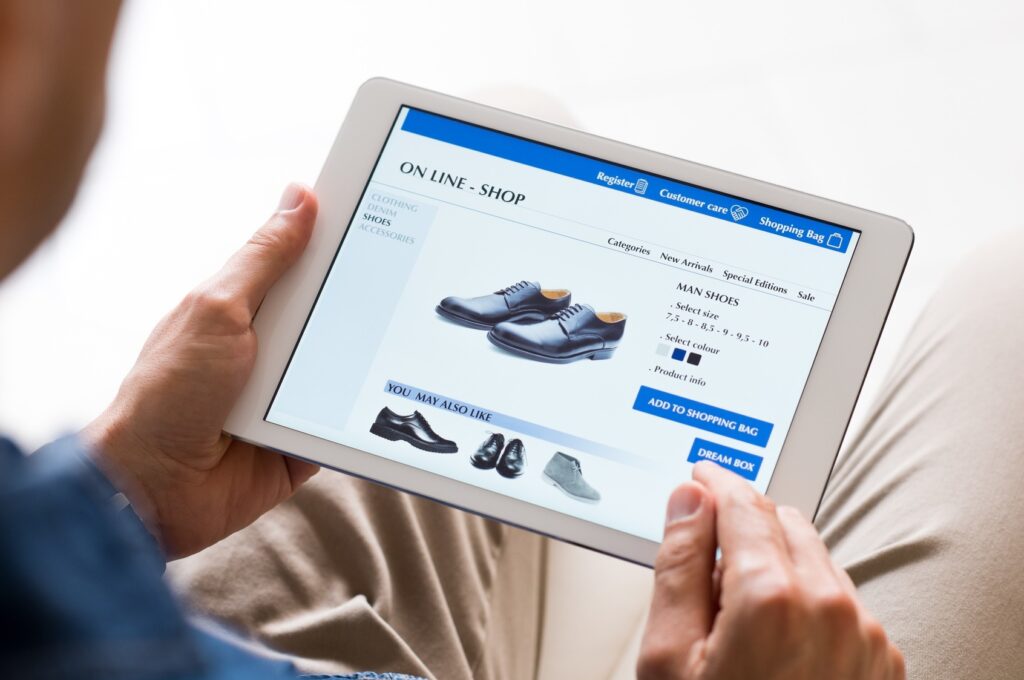
Second task: Keep the number of form fields at minimum
The mental rush associated with spending money is a well established phenomenon. Society likes to consume. However, some studies indicate that the excitement of redeeming a short simple purchase form is greater than simply paying less for a product! It all comes down to power. Users don’t like the part when they spend money. Therefore, making it easy and simple by minimizing the number of form fields significantly decreases the time spent at the unlikeable part of the deal.
The amount of work to put wanted information into right field, in right order, tends to stress users out. Apparently, the more information they are asked to give, the less secure they feel. Anxiety rises, causing even physical symptoms (especially a fast heart rate when something doesn’t add up in the purchase form) and blocks the way to closing the deal. When frustration buyers to drop off the deals at the final stage, the possibility to leave a good impression is gone forever. The power is simplicity of interface.
Have in mind that a checkout process is different than the rest of the browsing experience on a page. During the checkout process your customers aren’t shopping — they’re making a purchase. The gap of decision-making has been already closed, so the only challenge at that point is to create a positive impression. This means all the browsing controls are redundant here, and would only distract your customers from the task. The goal is to eliminate these unnecessary elements.
Third task: Never underestimate the power of testimonials
A great way to connect with prospects is via using stories from existing customers. Major UX trends come from knowing the value of social proof. Let’s be honest, we’re all somewhat cynical. We certainly don’t believe everything we’re told, especially when it comes from advertising. But we tend to rely on others people’s opinions. This is the main reason why social media in general has become such a force to be reckoned with.
Testimonials create an emotional appeal for any branding and, if smartly displayed, will help to convey your brand message. A testimonial from a client means that the person giving it is risking their reputation on their word. Therefore, it’s a very significant (and positive) bond between the business getting the testimonial and the individual giving it. Mind the way of giving it to the public: video testimonials or the ones with photos will help boost email marketing conversions, and increase your social media engagement. Including videos and photos in the checkout process impacts landing pages, as it frequently increases conversion. Nethertheless, among other benefits there is one premium advantage: a good testimonial increases trust and gives an incentive.
Forth task: Show the countdown timer
‘Scarcity marketing’ is known as marketing method that pushes the user into action. Recently one form of scarcity marketing is increasing in popularity – the countdown timer. Apparently letting customers know they only have a certain amount of time to act before the offer goes away is very persuasive. Adding a short message next to the timer may give more clarity as to what will happen when the time is up. It can also affirmatively encourage action.
Let users know (politely, of course) that they only have a short time to act or else the offer is gone, or give them some prompt to “go on” with a short sentence. Not only does the countdown timer create a sense of urgency, it engages them on a one-to-one level with the time-limited offer. Additional animation to visualize the process will make it appear like the whole universe awaits finalization too. This evokes the feeling of unwrapping a present, making the personalized experience at checkout feel exciting.
Fifth task: Users need many options and flexibility when it comes to payment
As obvious as it sounds, there are several websites that offer only an upfront payment method. Nevertheless, users’ trends show that more and more customers expect a variety of payment options, including delayed payment on the checkout page.
You need to take a look at your target audience to see which payment methods they prefer to use. The outcome may surprise you. People like to stretch to buy things that are financially below their current reach.
Checking out is usually a multi-step process. This means the customer will have to navigate several pages before the order is complete. To make this process usable, be sure to add the ‘no payment’ option. Another glance should say exactly when the customer is going to have to pay. A possible way of declaring of this state is to give a step by step list explaining what will follow. A frequently used solution is a payment plan. It’s a good business move to offer the users with less means an alternative solution for making payments. Users tend to depart from deals where instant payment is forced upon them. They prefer the ease of use, ease of buy.
Interested in more tips for convesrion-driven website? Check out more articlesat our blog.
Read about our services in Expertise.
