A good UI design increases conversion rates. That’s simple. But how does human-oriented design play into it? The mobile revolution, as well as the web revolution before it, constantly forced us to keep restructuring and reconsidering what simplicity means for human-centered design and practically every experience we create. In the UI user community, we’ve launched a trend called “human-centered” that helps you focus and lead every design project in a particular way.
There are numerous human experiences associated with using an application. They allow you to take a different perspective towards various projects to see how one solution is better than the other. The best ways of solving problems should be based on human needs. Ideally, you should fulfil those needs in a way that involves best practices and technological innovations.
Our team at ESPEO is working daily to accelerate UX performance at the user interface level, understand how to integrate the project with the UX toolbar and make sure that we create our products in a comprehensive way.

Tip one: Let yourself be direct – and stay honest
The rule of thumb is to be direct instead of indecisive. This way, you convey your message with certainty and confidence. Your design presents ideas or products determined to contribute to a user’s success. Leaders don’t end their messages with question marks, using hedging expressions such as “perhaps”, “maybe”, “interested?” and “want to?”. Your UI can be bit more authoritative.
Honesty with a user pays off, so in the whole narrative consider social proof instead of just talking about qualities. Nothing will increase your conversion as seriously as being sincere with the users. Showing endorsements and talking about your offering gives a significant performance for a call to action. Therefore, point towards proof of customer satisfaction via references or testimonials. If numbers are large – consider visualization of the data, as it validates your point in a clear way.
Tip two: Conversion – ease of use
A good way of achieving that is simply trying out a one-column layout instead of multicolumn. A one-column layout gives clarity and a more consistent narrative. Users have an easy path to move into a predictable scenario, whereas a multi-column approach moves the users’ attention onto other features. Therefore, there’s a great risk of being distracted from the core purpose of a page. Lead people with plain content and a smooth experience, and, at the end, a visible call to action.
Features of your own design style such as color, depth, and contrast may be deployed as a reliable tool to build communication with a user. With basic elements of specific design, users may be able to follow the fundamental language of navigating in any interface: what can I do, how can I do it? This needs a specific road map containing styles of clickable actions (links, buttons), selected elements (chosen items), and views of plain text. Each style should be easy to differentiate from the other in order to be applied consistently across an interface. This rule, if applied properly, keeps users happy and eager to interact further.
Looking for more Conversion tips? Check out our article: How to optimize your ecommerce page for better conversion.
Tip three: Uniting similar functions (merging!)
With every design, it’s easy to repeatedly create similar sections, elements and features which all have the same purpose. It’s the same force for the whole universe: entropy – the disorder and chaos of matter – increases with the volume of information. Uniting similar functions instead of fragmenting the UI will clear out some design complications: remove duplicated functions labelled in various ways, so it doesn’t clutter the content. In a few words, the more UI fragmentation there is, the higher the learning curve is for your users to catch up with. To prevent UI refactoring, the key competence is to merge similar functions together.
Repeating your call to action is a completely different case. Repeating the CTA is a strategy that is more applicable to longer (or wider) content. It can be also repeated across numerous pages. Naturally, users will be frustrated with one item persistently displayed a few times on one view. The wise choice in all the noise is to have one soft actionable element at the top, and second prominent one at the bottom. This is because users reaching the bottom of page seem to pause and consider their next step. So, that division has a great potential to repeat a solid offer or close a deal.
Tip four: Expose the options (have a clear view)
The revolution of pull down menus hides a set of actions which are the proper goal of every page or app. It also introduces the unnecessary effort of searching and discovering functions. All those actions are supposed to be centralized, almost like an app’s ‘spine’, so the scenario of user’s path keeps all the goals in the right order. Clarity and space for content is needed to bring attention to the right places. Possible actions should be visible upfront in an obvious way. On the other hand, the options that don’t need prediction or don’t require learning (as in sets of date and time references), can be placed in menus.
Maintaining the focus on goals is a demanding task for designers. It’s much easier to drown the user with links. It’s easy to create a page with lots of links going left and right in the hope of meeting as many customer needs as possible. If, however, the designer is a true artist, he or she is capable of creating a page with a wide content volume built towards a specific call to action at the bottom. Caution is required at every step, because any link above the primary CTA increases the danger of taking the users’ attention away from established purposes. Users then simply veer into directions they weren’t primarily intended to follow. The mission of lowering the number of distractions like the number of links on a page, and possibly toning down the discovery style pages (a bit heavier on the links) can be achieved with tunnel style pages (with fewer links and higher conversions).
Tip five: Showing state and benefit (give the users the tips and feedback they need!)
A nice way of building an understanding between users and designers is an UI with different states of displayed elements (read or unread emails, sent or packed orders). The customer feels secure with the knowledge of an item’s condition. The message about its state must provide the kind of feedback which is expected. It also brings satisfaction for users, as they can establish if their actions were successfully carried out, or if it’s time for the next step.
And here we have another piece of truth: buttons which reinforce a benefit might lead to higher conversions. Users simply know what they want. The designer is supposed to know the action from which the user benefits and put it right on the CTA. It’s all about looking at the ‘transaction’ from the right perspective. The benefit can also be placed next to the CTA, as a reminder why they are about to take that action.
Tip six: Gradual engagement
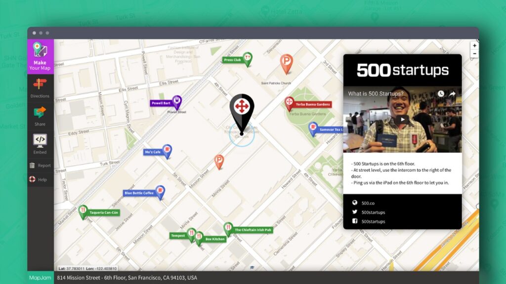
To build interest and gradual engagement, some subtlety is required. Instead of a pushy signup form, there must be some ease of use. The expectation that clients sign up immediately may scare them off. A page or app can be an opportunity to show them the product’s capabilities or a chance for them to perform a task through which something of value is demonstrated. It can build excitement and curiosity alongside initializing interactions.
These actions lead to a personalization of experiences. At the end, the user interacts with your product and sees its internal values. Gradual engagement is really a way of building an understanding of the product or service without conscious acknowledgment. It is a great way to postpone the signup process and prolong the user’s attention through using and customizing the application.
Tip seven: Recognition to recall
This principle of design is grounded in psychology. Psychologists suggest that when people have a choice, it’s easier for them to identify with something already known and immediately recognizable. To make an experience easier, recognition should rely on hints which help us consider our past experience. Recall requires us to probe the depths of memory all on our own, alternatively, it requires some guidance. This is similar to multiple choice questions on exams – they can be faster to complete than open-ended ones. The challenge with recognition is to give users recognizable items which they have been exposed to before, instead of expecting them to have an idea of their own.
Looking for more tips for UX and good UI design – read about UX Desing Trends to watch in 2018!
