Introduction to Material Design
During the journey of every Android Developer, we have observed various Material Design language rules. We started with the first guidelines of Material Design in 2014. Then we acknowledged the set of updates to the language in Material 2 in 2018. Finally, we have seen the major changes in the newest version of Material Design called Material You (Material 3) in 2021. I will introduce these changes through the years from the Android Developer’s perspective and describe the most valuable changes and new things in Material 3. Let’s begin!
We will go through the following issues:
Versioning of Material Design
Material design is a design language (scheme or style that guides the product design). There were 3 major versions of this language.
Material 1
Google introduced the first version of Google Material Design in 2014. The primary purpose of creating this language was to combine principles of good design with technical and scientific innovation. It allowed the unifying design of Google applications. What else, developers can exclude basic components with Google’s material components API.

Material 2
The next step was Material 2 (Material Theme), introduced in 2018 as an update of Material 1. The language went through some cosmetic changes to highlight the components even more.
The main differences between Material 1 and Material 2 are:
- new font — Google Sans,
- more white spaces,
- rounded corners,
- colorful icons, and so on.
The video below is a great example showing the migration from Material 1 to Material 2.
Material 3
Material 3, also known as Material You, is the newest version of Material Design. The two previous versions were strictly standardized. Otherwise, Material 3 focuses on user-oriented personalization. The newest version of the language introduced many updates. Some of them are listed below:
- dynamic colors based on the user’s wallpaper,
- different shapes,
- new typography,
- changed components (for example bigger buttons)
I believe that James Williams explains very well the changes between Material 2 and Material 3 in the article ‘Migrating to Material Design 3′ (source: Material Design Blog, uploaded at October 27, 2021).
Let’s dig deeper into the major features of Material 3.
Characteristics of Material 3
Dynamic colors
Material You focuses on a variety of different colors and shapes. The colors are fully customizable. On the contrary, with material 2, more apps look similar due to strict standards.
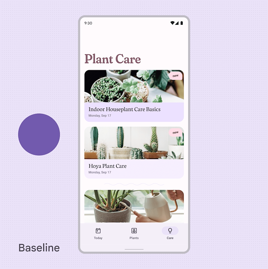
The dynamic colors allow the app to match the system color preferences. As you can see in the example above, the colors in the app change every time users change the wallpaper.
Shapes
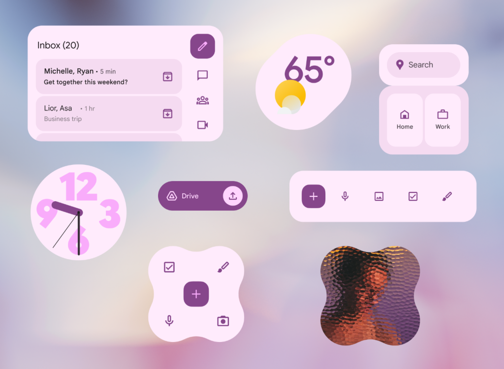
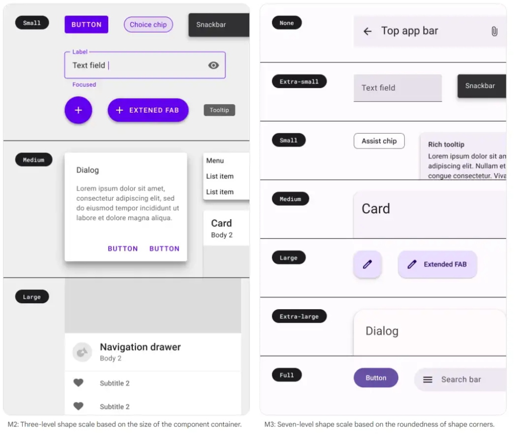
Material You is based on a variety of shapes. You can distinguish different ones used on one screen and even the 7-level shape scale based on the roundedness of the component corners.
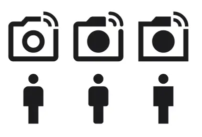
Material Icons
Also, Google has updated the icons to Material Icons, which can have slightly different versions. The symbols are easily customizable, and an updated version is available on the Google icon’s page.
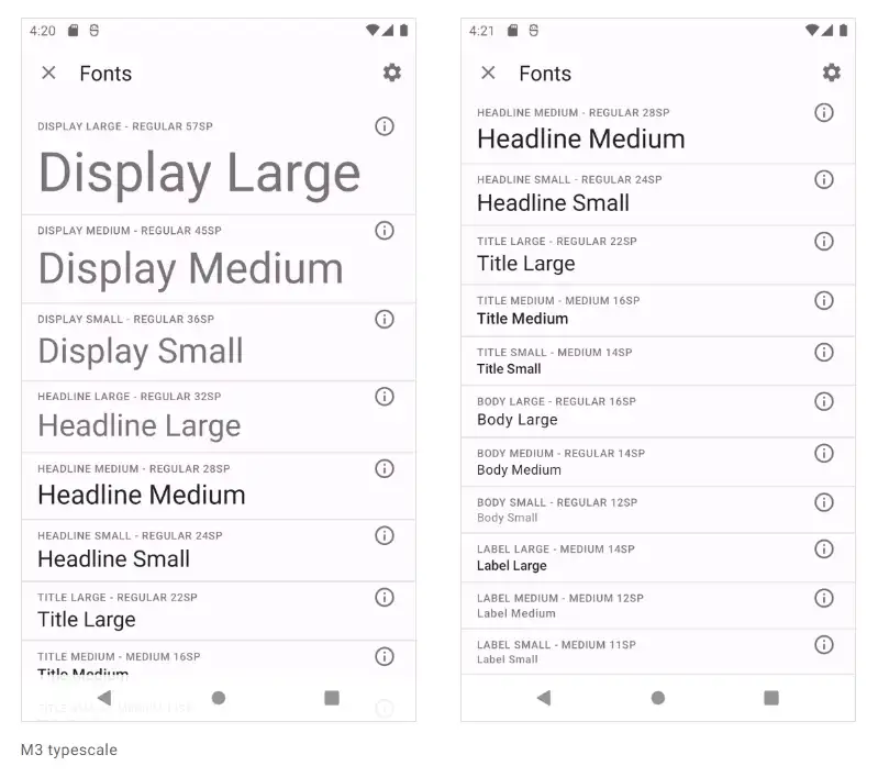
Topography
The Material 3 typography went through simplification. As a result, from the 6 Headline variations, currently (Jan 2022), we have fewer variants for each classification (Small, Medium, Large).
Design material components: Material 3
Buttons
Now, the buttons are rounded. Also, they are a bit higher than in Material 2.

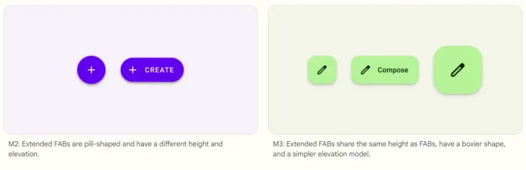
Floating Action Buttons
The Action Buttons in Android can be classified as Floating Action Buttons (FAB) or Extended Floating Action Buttons. FAB is a circular button that triggers the primary action in the UI apps. Extended Floating Action Button is the class with the Material Components library in Android. Concluding, it looks more rectangular now.
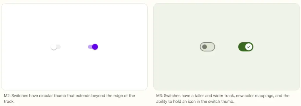
Switches
In Material 3, thumbs are not exceeding the switch track. Even more, there is a space between the thumb and the track.
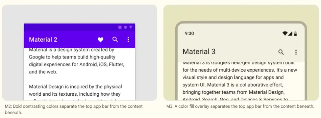
Top App Bar
The Top App Bar and the status bar (displaying the battery and the network icons) now have the same color. Also, there is less contrast between the app bar and the content below.
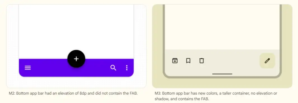
Bottom App Bar
The users are used to the Floating Action Button at the edge of the Bottom App Bar. However, the new Material expands the bar vertically and keeps the button inside.
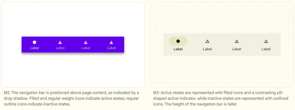
Navigation bars
The new navigation bar has a more distinguishable selected element by changing the icon to a fill version, bolding the label, and adding a shape around the icon in a different color.
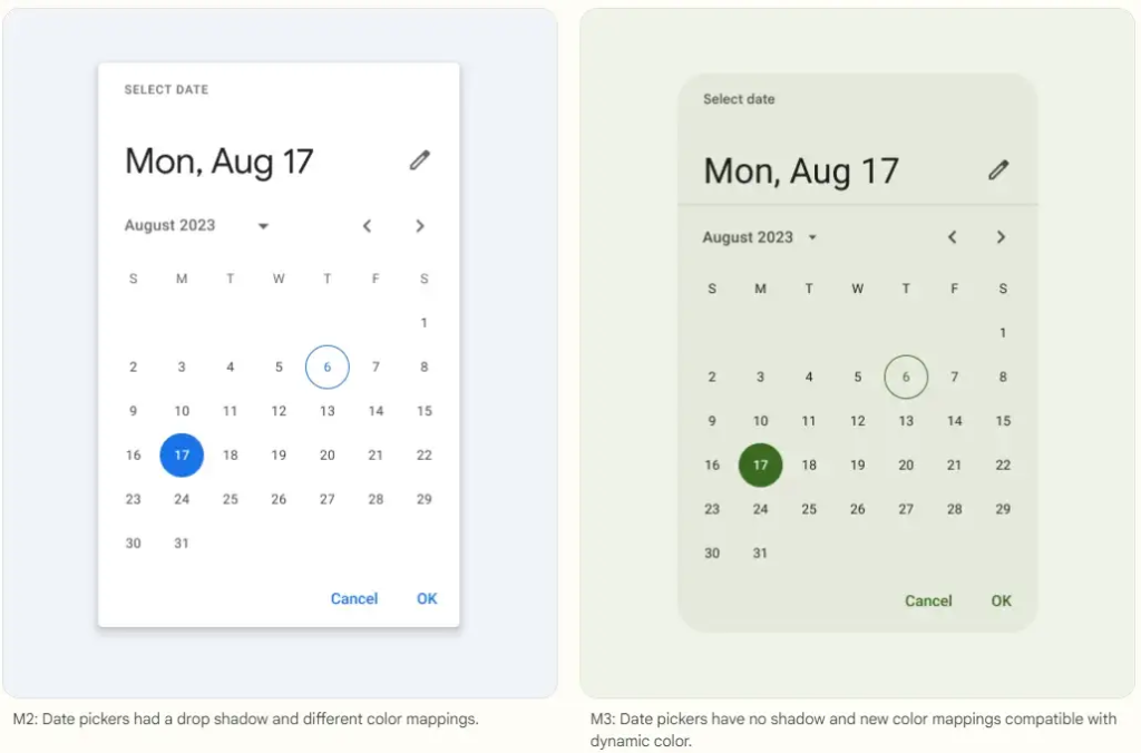
Date picker
The main difference in the date picker is color theming and the component borders which are rounded and without a drop shadow.
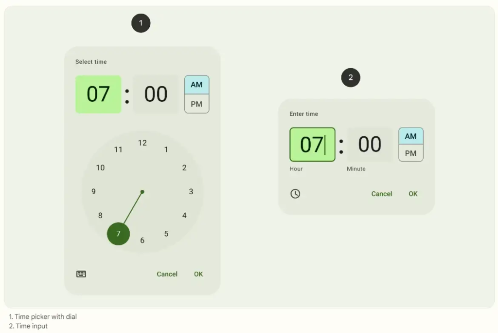
Time picker
Also, the time picker component is similar to the date picker component. I recommend a more detailed article about the implementation of the time picker component.
Check the article "MaterialTimePicker as an upgrade of the TimePickerDialog" (Patryk Kubiak, Feb 14, 2021).
Design of other components
Other components which have the comparison between Material 2 and Material 3:
And here you can find a full list of the Material 3 components.
Conclusion
From its premiere in 2014, Material Design language went through dozen changes. After a while, there was an update to Material 2. That wasn’t a big deal. However, the major changes came with Material 3. The first Android system with Material 3 released in late 2021.
Today is the beginning of 2023, and I think the next 2–3 years are the time for validating and uploading improvements to Material 3.
Therefore, the upcoming versions of Android OS and different Google UI libraries for programmers will need some changes.
Let’s observe what Google will develop in the coming years!