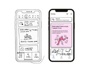
Switching from web development (especially from React.js community) into React Native world is a relatively hassle-free process. When you scratch the surface, new horizons will open up for you. The possibility of fast and efficient development of cross-platform native apps with JavaScript is totally worth it.
With each step further, new issues will pop up. Getting to know the right tools is just a part of the process. Moving from web to native is, in fact, a transfer to a whole different medium with an established order of things. One of its pillars strictly connects to user interaction which is much more direct than it is on web apps. Using your fingertips instead of a mouse cursor redefines user experience (UX), making it more immersive by definition. Animated elements in a native app need to respond to a user’s touch appropriately — much more so than on the web. Responsive animations mean the difference between an app people will want to use, or not. I’ll lay out some of the most important whys and hows in implementing motion to your future React Native.
Moving React Native. About specificity of native animations.
Table of contents:
The tools
When stepping into React Native development, abandon your CSS animations knowledge. From now on, to set apps in motion, you’ll be using the Animated library. If you’re not all about taking things as they are and you’re curious why that is and why we don’t implement animations using our favorite CSS-in-JS library, the Bridge is an answer. Bridge in React Native transfers information between JS thread and native threads. With Animated we can use so-called native driver, which works in favor of the app’s performance. We send the animation data to one of the native threads and all the work happens there. It helps to avoid blocking the JavaScript thread, because you don’t have to send new information across the Bridge after every frame.
Animated library is packed up with its own components, methods, and properties which will allow you to create all kinds of animations that you’ve seen in native apps. But if enriching your app with complex animations easily is something that interests you, then trying out Lottie or Facebook’s Keyframes will be a good way to go. Both libraries are made to import designs directly from Adobe After Effects as JSON files and implement it in your app with no extra effort.
The rules
When in native, do as native developers do. The biggest players out there, Apple and Google, are giving us pretty strict guidelines, how they would like to see every new application coming into their ecosystems. Both companies have prepared complex design systems and animation guidelines are just a small part of it. When starting with native development it’s a good idea to get acquainted with the whole thing, because even if our job is only about implementing someone else’s design, it’s better to understand why some specific decisions were made.
These design systems are Apple’s Human Interface Guidelines (HIG in short) and Google’s Material Design. Both vary in some core concepts, but the main idea behind them is the same — to provide their users a consistent experience across different applications, so they could confidently navigate through interfaces and easily predict consequences of their actions. It’s one of several principles of good UX our lead designer Mateusz Małys cited recently in his essential UX tips post. Expected business outcomes should be users’ willingness to come back to an app and, ultimately, grow trust to companies behind it. Tips you’ll get will be based mostly on Apple’s HIG and Material guidelines.
The idea behind
What’s the main argument for putting your app in motion? First, let’s make clear what it isn’t. Making your app visually attractive should never be your approach. Setting some element in motion just because it seems nice at first glance, but gives no useful information is the easiest way to ruin your app’s UX. React native animations ought to be meaningful and connected with actions that the user has performed or we’d like him to perform.
Getting lost in the app’s interface, losing focus, being left without expected response — all these are great reasons to stop using such app and abandon it forever. That’s why React Native developers like me use motion to enhance navigation. Transition between views is a crucial moment because done wrong it can cause noticeable gaps in user flow — long enough for users to lose focus and interest. The key concept here is to make this experience feel natural and similar to real-life interactions. Google’s Motion figuratively indicates that users should know where elements came from. Think of turning pages in a book and moving from one information to another in natural and predictable direction. Similar digital interactions should mimic their analog counterparts. This kind of behavioral skeuomorphism makes navigation much more transparent. Users can see the direction of movement and the relationship between cause and effect in their actions. That’s where the aesthetic animated transition can be used. If used in between a few pages of form can be perceived as rewarding for user’s efforts to fill the form and he’ll more likely finish the action in good mood.
The responsiveness
The most important distinction in native animations is that there are two types of animations — direct manipulation and interaction confirmation.
So-called direct manipulations are tightly connected to touch user interface, or TUI. While drag and dropping some element we expect it to move instantly and follow our fingertip. A huge mistake would be to neglect any performance issues of instantaneous animation we are implementing. Animations that lag — even beautiful ones — will doom the app to failure.
Equally important in native apps is using animations that visually confirm the user’s interactions. A user who just performed a key action in our app, shouldn’t wait for a server response to be processed. If so, there’s no better opening for a worst-case scenario in which the user, just before deleting our app, clicks rapidly, while his frustration grows with each one. Just the opposite in its consequences would be a situation when, after performing an important action, relevant animation would be executed. Things get as more serious, as performed actions are connected to the user’s real life, especially his financial resources — in every transactional-based interaction providing smooth visual confirmation is essential.
The timing
Technically we could take any animation design that was made for web and implement it in a native app. So what stops us? It’s definitely not a matter of our device’s specs, nor even specificity of touch user interface — it’s the obvious, but easy to ignore matter of scale. Screen of mobile device is significantly smaller than a laptop screen and smaller size means shorter distances to be covered for any moving element. Providing the same duration for all devices, would make animations look unnatural and irritating in at least some cases.
Let’s talk numbers. Sufficient duration time for every animation is somewhere between 100ms and 1 second. Everything above a second will bore users and everything below 0.1s will go unnoticed. Duration of specific animation should depend on the amount of screen’s space it occupies — for example, a full-screen transition, if not too complex, can last 300ms, while button animation can easily last 100ms. Necessary adjustments can be done by increasing or decreasing its duration by 25ms at a time. More meaningful animations can last longer to draw the user’s eye to it. Therefore we should be aware of distinction between enter and exit animations and make the second ones quicker as it’s less important for user flow.
Another thing is when we can’t certainly estimate duration — let’s take loaders and pull-to-refresh animations as an example. Keeping the user’s attention in mind, we can provide a non-monotonous loader made of several short animations that would change over time to avoid exceeding the 1 second limit.
As you may notice, timing is probably the most important in designing user-friendly animations. Except proper duration time, we can’t forget about motion itself. I’ll leave to you digging into specificity of different motion curves, but one thing needs clarification. To keep user’s attention and make our animations look professional enough, motion must not look unnatural and there’s nothing more artificial in motion than making it linear (as long as there’s no such thing in the physical world). Elements must accelerate or decelerate at some point and that’s what we call easing. Ease-in (acceleration) and ease-out (deceleration) are the simplest (but adequate in most cases) effects we can use. Going further with connotations to physical world ease-out will be better for enter animation (decelerating element’s movement when it reaches its place) and ease-in will be great for exit animations.
Summary
Wrapping it all up, switch to native for web developers is easier right now than it ever was and it’s all thanks to the capabilities of React Native. This amazing tool allows us to write cross-platform native apps with JavaScript, while saving time and resources. Although, we need to be aware that native is not only a different device, but a separate medium with its own specificity. Animations are one of those things that works a little different in native and its impact on UX is even more significant than in the web. That’s why, as developers, we are obliged to follow some existing rules and guidelines about implementing motion in native. It’s the best way to provide users pleasant and native-like experience, what’s definitely is our goal while starting with React Native.


