I’m sitting on the bench next to the seafront, close to Brighton Pier. Thinking how to summarize what I’ve learned yesterday, and how to use this knowledge during the following weeks at work. Also, I’m browsing the dictionary for a synonyms of ‘incredible’. Because I’ll be using those quite profusely now. FFConf is definitely the best conference I’ve been to so far. Why? Its speakers looked at the bigger picture: showing the beauty of the Web to ALL users, even the ones you rarely think about.

What makes FFconf different from any other Web/ Front End Development event?
You could tell it would be something new from Remy’s blog post about CFP. Remy, the conference organizer, is the creator of Nodemon and JSBin. The other conferences I’ve attended this year (e.g Meet.js Summit and Confitura) generally focused on engineering-specific tasks or how to use a given technology. FFConf seemed to be about looking at the bigger picture and addressing universal webdev problems. However, there still was plenty of room for slightly more technical talks. All of them were powerful. All of them made me look at my profession and the way I work from a different perspective.
The major take-away for me would be the fact that the Web is just too beautiful, and its beauty should be shared with everyone. It’s worth spending as much time as necessary to show the magic to all the users. Many developers don’t think too often about some groups of users and that’s a huge mistake. People using screen readers, low-end – sometimes old, therefore slow – mobile devices, or simply people experiencing temporary problems with their Internet connectivity are often neglected. Thanks to conferences like FFConf, topics related to accessibility, progressive enhancement, offline content delivery and web-performance in general are spread into hundreds of developers’ minds.
Next level CSS
First on the schedule was Rachel Andrew’s talk about features that are being adopted into new browser engines. Some already have been. Even though I was aware of some of the presented functionalities (mostly thanks to Tomek Wyrębowicz and his talk at this year’s Meet.js Summit) I was impressed by feature queries. Thanks to them, we can move some responsibility previously supplied by Modernizr to css itself. We can apply specific styles depending on whether the browser is capable of handling the feature or not. It also means we can gracefully degrade our design to a version that’s still usable and contentful (though not so shiny). Rachel has also presented a bunch of other features I can’t wait to get my hands on, like native grid, shapes and path-clipping.
Progressive Web
The first thing that comes to my mind when I hear ‘Progressive Web’ is Jeremy Keith’s talk he gave last year at local Brighton JavaScript meet up. It was the first Async I’ve attended, but right after his talk I realized I’ll be visiting 68 Middle Street regularly. Back in October 2015 it completely changed the way how I think about developing for web and what really matters when it comes to the essence of our profession. Delivering content/functionality, regardless of the version of the browser, Internet connection speed or age of device somebody might be using.
Yesterday’s talk by Ada Rose Edwards wasn’t only an excellent complement to Jeremy’s insights. It was also an incredible journey to the world of performance and accessible content – including some technical aspects of both. I’ve learned it’s crucial to deliver the functionality not to the majority, but to everybody. Also, the performance is already there, and our job is not to break it. As for breaking the web – yet another great talk came to my mind – Bruce Lawson and his ‘How to destroy the web’.
https://www.youtube.com/embed/Yf8ACKrZTJI”
Technologic (Human after all) Accessibility remix
I’ve seen Léonie Watson’s ‘ARIA, Accessibility APIs and coding like you give a damn!’ before (Front Trends 2015), and she inspired me to do my job the right way. Thanks to her, I realized which content can be read by a screen reader and which – because of bad code – cannot. Her last year’s presentation was a breakthrough for me as I hadn’t been properly ‘giving a damn’ about my code before, as it turned out. Now I’m doing my best. My apps can work fine for people who use a screen reader every day.
This year’s talk was based on Daft Punk’s ‘Technologic’. Léonie used the words of the song to show what kind of actions are difficult when you use a screen reader. Fortunately, she has also showed us how to fix these problems. One of the addressed issues was ordering buttons/links with flexbox and its impact on keyboard users. When you care about a11y (and you definitely should) you have to remember: the order of content in DOM structure is important and depending on where you put it, it might be read without its surrounding context. When it comes to ordering elements with flexbox, the order of the elements’ focus is also different, so this issue is worth addressing.
Screen reader action
Léonie also strongly encouraged attendees to check out the screen reader on their own. It’s available on any modern operating system. Even though it wouldn’t make much sense to somebody who doesn’t use it, it can give a brief idea about how your app can be perceived. She also challenged us to unplug our mouses and play with our apps using only the screen and keyboard. Those ideas sounded a bit similar to Facebook’s 2g Tuesdays. Even though they’re addressing different issues, both are helping make the Web accessible and available for a wider spectrum of users. Léonie also made a great point about continuous improvement. The accessibility of your app doesn’t have to be perfect – just better than yesterday.
All things continuous
Andrew Martin showed us the foundations of successful product shipment. The sentence that could sum up his thoughts could be ‘Release (early) or die trying’. He presented his opinions on some wonderful tools that help make the deployment & development processes much more developer-friendly. Just to name few of them: Docker, Kubernetes, GitLab, Linkerd or Logz.io. At Espeo, we use Docker and Gitlab pretty often. I have to agree with Andrew, those help a lot.
Another great idea is to automate everything that can be automated. Andrew mentioned the pyramid of tests and tried to convince the audience that thanks to robust automatic test environment, we can actually minimize the participation of QA teams in the software development process. In his opinion, those teams could be considered as an organizational anti-pattern. Instead of investing in manual testing, he proposed to utilize the QAs’ specialized skills to produce edge case scenarios specific to a given Business Domain. Those scenarios could later be implemented as automated tests and – unlike manual testing – would be consistent and deterministic. He also mentioned it’s good to automate processes like linting and style checking, so the person performing the code review can focus on what really matters.
Canary deployment
Another great thing was Canary deployment. Andrew presented ready-to-use tools that make incremental deployment easy to perform. Canary deployment is about gradually introducing new versions of specific software. Starting with small group of users (e.g from some specific region), monitoring crucial app parameters, and gradually switching next nodes (regions) to new version. It’s a common pattern for enterprise organizations. However, Andrew mentioned that thanks to the modern dev-ops movement, the approach is getting more popular with smaller scale applications as well.
The power of emoji
Mariko Kosaka took us back from the technical world to the one focused on people and communications. Emoji have been around for a while. I use them pretty much every day. I’ve even added some icons to our company’s Slack (that’s what for my Photoshop subscription is mostly utilized for). Yet, I’ve never wondered why would somebody ever think the return to image communication could be a good idea. Nevertheless, it turned out to lead an important change in communication. Just look at your social media feed.
During Mariko’s talk I learned about the history of Emoji, the way they got standardized, and what the initial idea behind them was. Emoji in Japanese stands for ‘character picture’. Shigetaka Kurita created them in 1998 to simplify communication on early mobile internet services in Japan. The first set of icons conveyed specific information. For instance, these could be weather, horoscopes or other ‘Internet services’ you might remember from 90s phones. Apart from that, Shigetaka found great inspiration in Manga. So, some sets of Emoji were meant to show specific emotions or movement. Also, Kurita didn’t want to put any religious, skin tone or sex references to keep things neutral. Nevertheless, almost 20 years later we’ve got a number of flags representing each country, number of different skin tones for icons and religious symbols.
During the development of Emoji there was a number of funny situations. For example, because of different standards of implementations and the lack of mapping between them, the note icon sent from one device could be recognised as… a poop icon on another. I’ve also learned that ✊ ✋✌️were initially meant to represent rock, paper and scissors.
Optimize your web development workflow
Umar Hansa brought a geeky sense of humour (which I love) onto the stage. He presented lot of shiny new features available in Chrome Canary. I’ve seen some of them already. However, many of them were completely new to me. The way Umar presented them was definitely worth refreshing my knowledge. I was really impressed by both Umar’s presentation and the amount of work Google devs put into improving Developer Experience. Just a few features:
- CPU throttling and measuring the time of specific line of code to run in the simulated environment,
- Terminal in chrome – yes, you can actually access your shell using the webtools,
- Node debugging and inline editing,
- CSS coverage – audit your app and check which style definitions were actually used to render the page and which could be removed or loaded asynchronously,
- Review how your page is actually being rendered frame by frame,
- Animation edition tools, and timing adjustment,
- Filtering network requests
That’s just some of them, but those listed above would be definitely very helpful in my day-to-day work. I can’t wait to use them!
A brief history and mis-history of modularity
Software development is about managing the change. The change could be hidden behind specialized modules. That’s the greatest power of modularity. It’s a huge simplification and just my naive interpretation of Ashley Williams’ great talk about the pros and cons of highly modularized software. She listed a number of developers’ opinions, often leading to the assumption the modular software is ‘better’ than the monolith approach. To name a few: testability, composability and maintainability. Apart from that, she included a really charming quote by Julia Evans (@b0rk) ‘people got mad when I put it all in one file’.
How small is too small?
The talk made me think about what really should be considered as a module, and ‘how small is too small for module’. Ashley gathered an impressive set of opinions on modularity and provoked us to review the way we think about modules. I really liked the idea of writing ‘deletable’ instead of ‘extendable’ software, so your modules can be replaced when the ‘change’ happens. Another valuable quote by Nolan Lawson: ‘the more I modularize my code, the bigger it gets’. This led to interesting metaphor: fighting against a 100 duck-sized horses versus 1 horse-sized duck (beautifully illustrated by Ashley).
Art.js
The last talk was an impressive journey into music visualization, on-canvas coding and a really great session of live (and life?) coding by Mathieu Henri. He managed to code a beautiful visualization of Conway’s Game of Life in a really short time. Not to mention the music playing in tune to the Game’s state. Mathieu gave me an insight into how basic math calculations can result in powerful and good looking data visualizations. He showed his side projects, crafted without any frameworks or libs. He also patiently responded to questions about why would one do such a thing.
Mathieu rightly noticed that side projects help the developer to think how to structure the code. And they provide a lot of fun. Also, lot of small projects he created were really small in terms of codebase size, but powerful in terms of what they present. This builds the developer’s awareness of low level abstraction and makes him/her comfortable with mechanisms sitting close to the metal (or to the browser, actually).
Immutable brains
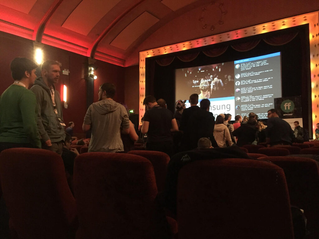
I just couldn’t resist sharing the fabulous label the guys from Brandwatch put on ice cream:
Sketches and notes
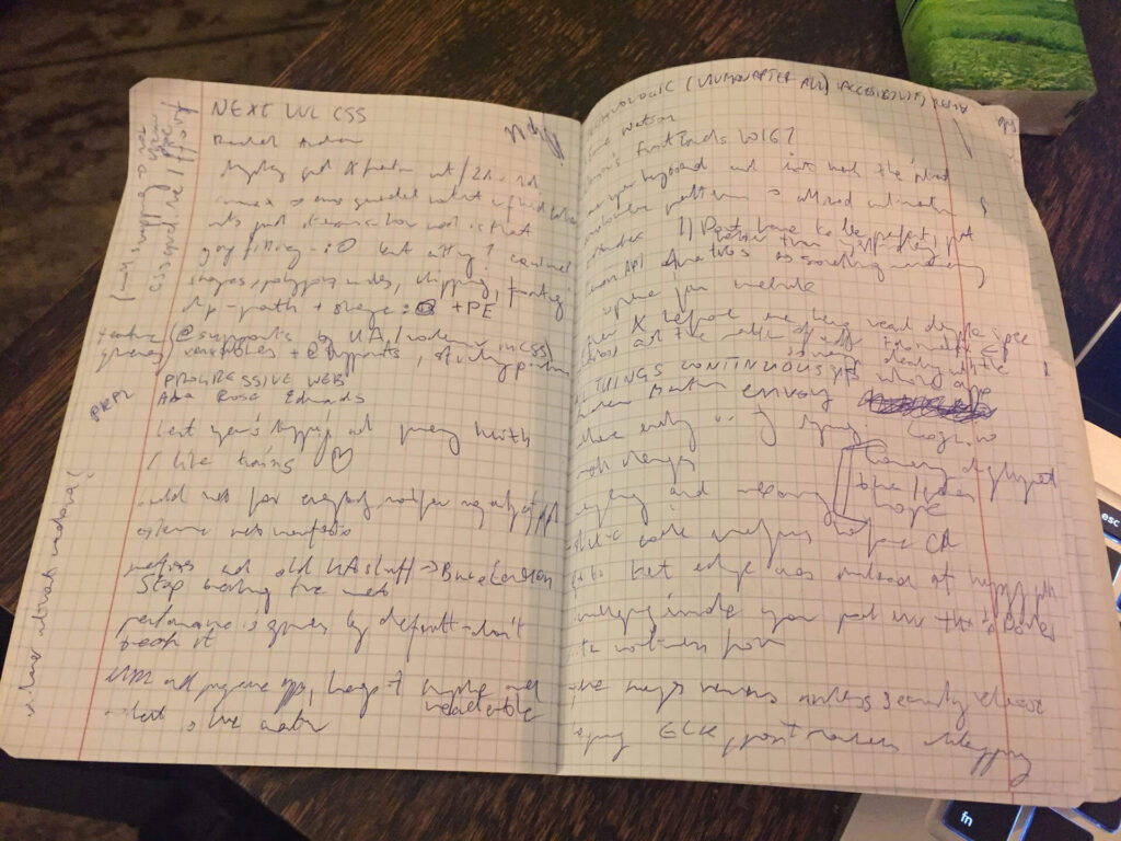
While checking out the #ffconf tag on Twitter, I came across some sketches and notes, so I decided to make my own as well. Encrypted by default.
Reality > Expectations
As you’ve read in the first paragraphs, I knew the conference would be an incredibly valuable adventure. It turns out I’ve learned and experienced much more than I could even expect. Thanks to the speakers (and Julie and Remy who made the whole thing happen) I got inspired in so many ways. I gathered a lot of technical knowledge. I’ve learned a lot about the power of accessibility and value of performance. What’s more, I looked at the wider context of software development itself.
If you haven’t been at FFConf and are interested in Web Development, you definitely have to watch the sessions’ recordings once they’re out.


